Sinogas Will Launch Its New Logo in 2026

Tianjin Sinogas Repower Energy Co., Ltd. hereby officially announces the comprehensive upgrade of its corporate logo. Far beyond a simple visual revamp, this logo upgrade serves as a critical carrier for the company’s strategic upgrading. It is designed to convey Sinogas’s unswerving commitment to delivering technical solutions for the entire natural gas industry chain, while also manifesting the enterprise’s future development visions, through a more contemporary and distinctive visual language.
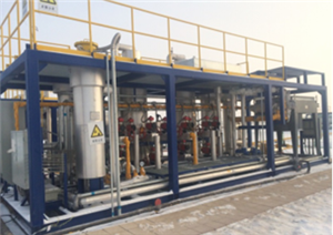
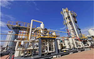
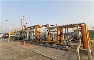
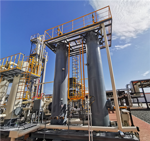
Since its establishment in 2009, Sinogas has consistently adhered to the core tenets of environmental friendliness, cost-effectiveness and high efficiency, providing professional, reliable and innovative one-stop supply chain services and technical solutions for the natural gas industry. After more than a decade of dedicated efforts and market expansion, the company has established collaborative partnerships with clients across over 36 countries worldwide. With the diversified development of the market, as well as the strategic expansion and innovative breakthroughs of its own business, the original logo can no longer fully encapsulate the company’s growth trajectory and future strategic blueprint.
The new logo has achieved a full-range optimized upgrade while retaining the company’s core values: the letter "S" cuts across the circular emblem like a bolt of lightning, not only symbolizing that the brilliant contribution of new energy to safeguarding the Earth’s ecological environment is as striking as lightning, but also revealing the enterprise’s capability for efficient and unobstructed energy transmission. The curved lines connecting the letters depict a dynamic posture of upward growth, signifying both the global outreach of "Made in China" entities as a group and the seamless flow of energy supply reaching every household. The upgraded color palette not only retains the core concept of green environmental protection, but also accentuates the vibrant dynamism and innovative spirit of the professional team with a vivid bright orange.
"We have always believed that an excellent corporate logo is the primary language of communication between an enterprise and its clients," stated Yang Yi, General Manager of the company. "Special thanks to our valued customers for your trust and support over the years! Upon this revamp, the enterprise will continue to deepen its footprint across the entire natural gas industry chain, and continuously increase investment in product R&D, service improvement and technological innovation, among other key areas, to meet the diverse needs of global clients. We will also work together with industry partners to jointly drive the high-quality and sound development of the natural gas industry."